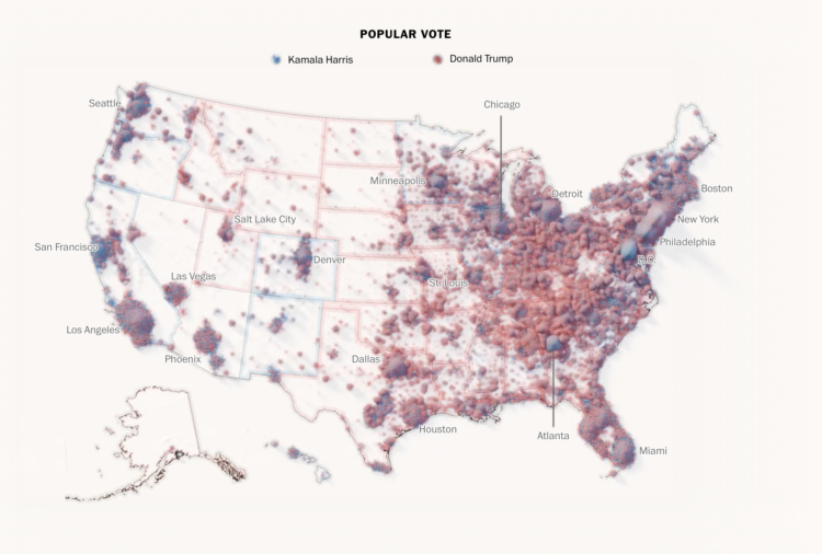
To show the mix of votes across the country, the Washington Post used a sand pile metaphor. Each grain of sand represents a vote for red or blue, and more votes create larger piles. Some piles are more red and some are more blue, but overall, you get a lot of mixed piles.
This is in contrast to a choropleth map that shows the winner in each region. One is not necessarily better than the other. Instead, this sand map shows a different angle to the data.
Tags: election, metaphor, Washington Post